

Okay, this article is going to sound lame at first, but hear me out.
Imagine that you had an inside track on a simple, weird technique that could work like a top-notch fishing lure, or a radar homing beacon, or like the smell of coffee and bacon in the morning when it comes to getting a woman to notice you – and not only just notice you, but not consciously realizing why she is noticing you. On top of that, if you perfect this technique, you will magically increase your charisma and persuasiveness the moment you walk into a room.
The secret is subliminal and it revolves around the colors of your clothing. No shit.
So powerful is this secret that the most successful companies in the world – not just clothing manufacturers – but those who make furniture, paint, cars, even top restaurants (!) pay strict attention to the colors they use in their products and the places in which present them. They actually color their products to make them more desirable. And so powerful is this secret that every year – every year – the specific “magic” colors change and all the great companies in the world jump on the bandwagon to adapt their products accordingly.
Just how do these colors get selected and who does the selection? The Pantone Color Institute, that’s who.
Pantone is the world-renowned authority on color and Pantone provides color systems and leading technology for the selection and accurate communication of color across a wide range of industries, from designers to manufacturers to retailers and finally down to you, the customer.
Pantone operates The Pantone Color Institute is a color research and information center that shares its color expertise with professionals in a variety of industries including fashion, commercial/industrial, contract and interior design, graphic arts, advertising, film and education. Recognized throughout the world as the leading source of color information, the Institute is used as a resource by the world’s most influential media.
So, if the world’s most influential media are all coordinating the colors they use, shouldn’t you? When you pick out a shirt, sweater, suit; a pair of pants; a new car even, what colors should you choose? Well, here are the Panton Institute’s color choices for 2017. And if you don’t think we’re giving you the straight-up on this, just look around and see what colors the women around you are wearing. What colors are being shown in all the clothing store windows? Are they anything like these colors below?
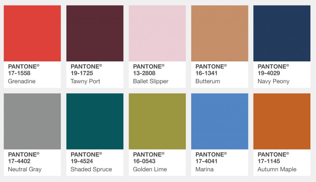
The current Pantone color palette. Photo Credit: PantoneThese are The Pantone Institute’s Fall 2017 Color Palette for New York. “Bookended by a dynamic Grenadine red and a tawny Autumn Maple, the color palette for Fall 2017 leans more to warmth, “ says Executive Director, Leatrice Eiseman. “While comforting, enveloping colors and ease are crucial to the seasonal feeling, standout shades include a pale pink Ballet Slipper, a refreshing Golden Lime, and a bright Marina blue. These hues add a striking touch when paired with the classic autumnal shades of Navy Peony, Neutral Gray, Butterrum and Tawny Port.”
Okay, so maybe you don’t see yourself wearing a pair of slacks in “Ballet Slipper,” but what about a tie or watch band? Remember, it isn’t you whom you are dressing for. It’s for the lady who’s eyes are going to latch on to that color and wake up something in her deep subconscious that turns her head your way.
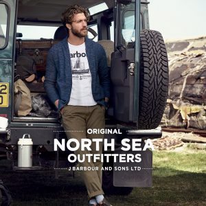
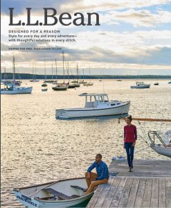
Don’t take my word for it? Have a look at the menswear catalogs below and notice the colors that match the Pantone display above:


And it’s not just fashion. Here’s a view I caught yesterday while working out in a gym that overlooks an Optimum Cable truck parking lot. Even the trucks are using the Pantone pallete!

Now, if you want the Color Palette for Spring 2017, for New York or anywhere else, you’ll just have to wait. Clients of Pantone pay big bucks to be the first with the best colors. But don’t worry, it usually takes a year or more for all the colors to percolate down to the local J. C. Penny or T. J. Max stores, so unless you just have to be the first with the best, use the colors above and get yourself noticed, my good man! Get noticed!